


Clay Cook’s print promo was equally the most exciting and challenging project I’ve worked on at Wonderful Machine. It required an abundance of creativity but even more coordination. Yet through hours of collaboration, we came up with a finished product that we were proud of.
Clay, who is based out of Louisville, Kentucky, has worked with us on several projects, from list builds to marketing materials. And since we’d already gotten to know each other (when I created an emailer template for him) he was confident that I understood his brand and would create a design that suited his style.
Overall, I was impressed that he knew exactly what he wanted. Clay envisioned a vertical promo book with a wire-o bind and messy, wild interior pages inspired by his partner’s sketchbook. We discussed the details, but the sketchbook concept was all I needed, and I immediately got to work creating a rough draft with three concepts.
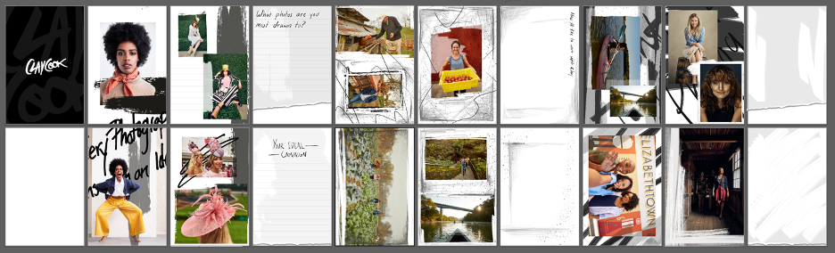
The theme for the first concept was text and writing. My idea was to make it interactive, so I incorporated handwritten text, lined pages, and blocks. Since the concept was a notebook, why not leave some room for the recipient to use it as one? This is why you see blank pages that separate the concepts — to allow for a resting page where the user can input their notes.
Concept two was more about graphite marks. Rather than a heavy marker look, I stuck to the pencil, creating a softer look while maintaining the messiness of a beloved sketchbook. The last concept mixed some text with thick background strokes which acted as borders and overlays on top of the images.
The feedback I got from Clay was positive overall. He wasn’t as interested in the interactive element and asked to remove the lined blocks and the blank pages. But other than that, he loved all three concepts and asked if I could mash them together for one wild masterpiece, a task I was happy to oblige.
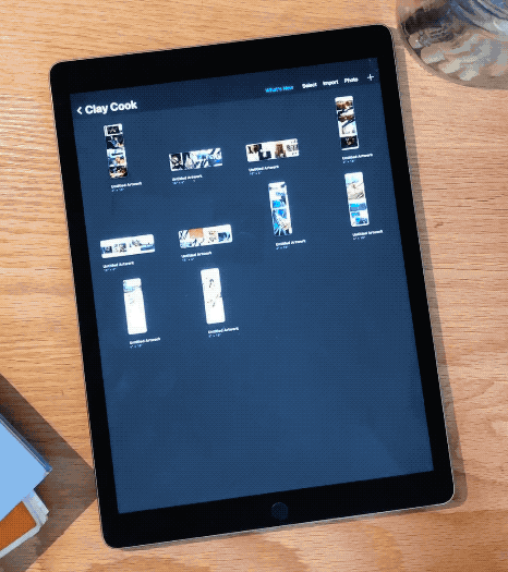
Before I go further, let me tell you about how valuable Procreate was for this project. I’ve always felt very fortunate to have an iPad and iPencil in my toolbox, and this was the perfect opportunity to utilize the easy platform and variety of brushstrokes to create the sketchbook aesthetic.
While I built all 22 pages for Clay’s print promo, he also wanted to utilize our expertise in photo editing. This was when we brought Photo Editor Honore Brown into the mix.
Clay decided that for this promo, he not only wanted to focus on his commercial work but on one specific project he did for Celaya Tequila. A new tequila company founded by the NFL duo Ryan and Matt Kalil, the two are brothers who started a business to honor their Grandmother and Mexican heritage. Clay helped tremendously by photographing the process and picturesque agave fields.
These images are beautiful examples of brand narratives. They are also the type of work that Clay wants to do in the future, so this was the perfect opportunity to showcase his ability. Looking for a mix of portraits, landscape, product, and narrative imagery, Clay sent the portfolio to Honore (who nailed it, in my personal opinion). We had the final edit in no time, which was super helpful since working with the exact photos, instead of placement imagery, helped customize each spread from the get-go.

Now let’s get into some of the challenges. We wanted this to look as authentic as possible. This meant adding texture and rips — a process that we found extremely expensive. So while the original design had embossed brushstrokes and die-cut “tears” for each page, it was hard to find a company that could do it all for us!
The closest we got was Smartpress, a great Minnesota shop. They had all the features we were looking for, however, custom (and complex) die cuts and embossing would have increased the price astronomically. And while we tried to pare down and select pages to have the extra customizations, Clay and I ultimately agreed that if we couldn’t go big — we’d have to go home! Fireball is a local printing shop right here in Philadelphia. I’ve been using them since my college days, and they’ve certainly gained a reputation for being generally all-around awesome.
Fireball came through, not only with the price but also with the printing style. Clay felt it was crucial not to have any shine in the prints — he wanted the ultimate matte finish. But when you print digitally, most inkjet printers just lay the ink on top of the paper, so even if you use matte paper, you’ll still get a little bit of luster from the ink.
It just so happens that Fireball uses a different style of printing called HP Indigo. It’s the closest you can come to an offset print and had no luster whatsoever. The best part was because they were close by, we didn’t have to wait for test prints in the mail — I could run (or even bike) over and pick them up as soon as they were done, saving us some time! I could check the color profile and slightly obsess over paper quality. Clay made it clear that he wanted to prioritize the tactile quality of the book, so I had to make sure everything both looked and felt good.


The last challenge was the cover. Printing companies do not always supply the cover. We wanted a cloth-wrapped, white-foil-stamped cover with a wire-O bind and I did a lot of research to find a suitable binder. While many companies were willing to try and work out our specific needs, Bindery Partners was the only company I spoke to that, without hesitation, had the means to get our job done. They showed their expertise from our first call and made an excellent first impression.
As soon as Fireball finished the prints, they mailed everything to Bindery Partners, who ordered the needed materials and opened the job. And while I admittedly became quite the nag, asking for updates every other day, they finished the job and it was truly perfect. Clay wrote to me after he first saw them:
They have arrived and it’s hard to believe. I think they turned out wonderful, the cover is exactly what I wanted. It’s a stark contrast from our first iteration. Thank you again for all the hard work and extra effort into it. It’s one for the books!