Many hands is a new coffee roaster whose brand was a blank canvas. We just had a logo and color palette to work with. So after a few meetings with owners, Jeff and Miles, I knew we had a lot of space to play around with.
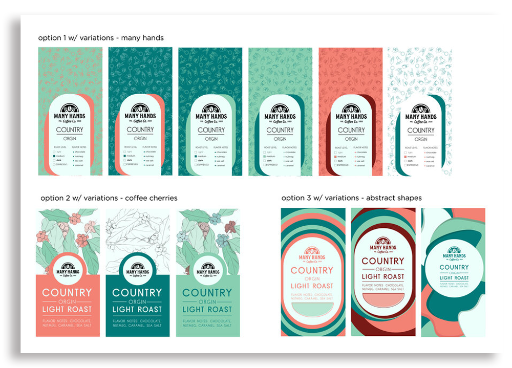
For the first round of designs, I came up with three general concepts. First, I wanted to play with the idea of many hands. So I created a pattern with hands doing different gestures (like the peace sign, the love symbol, rock on, and a thumbs up) as well as hands holding various coffee-related tools. Second, I got to the roots and used the cherry plant as the background design. Last, I went with a simpler look, using ovals and shapes to
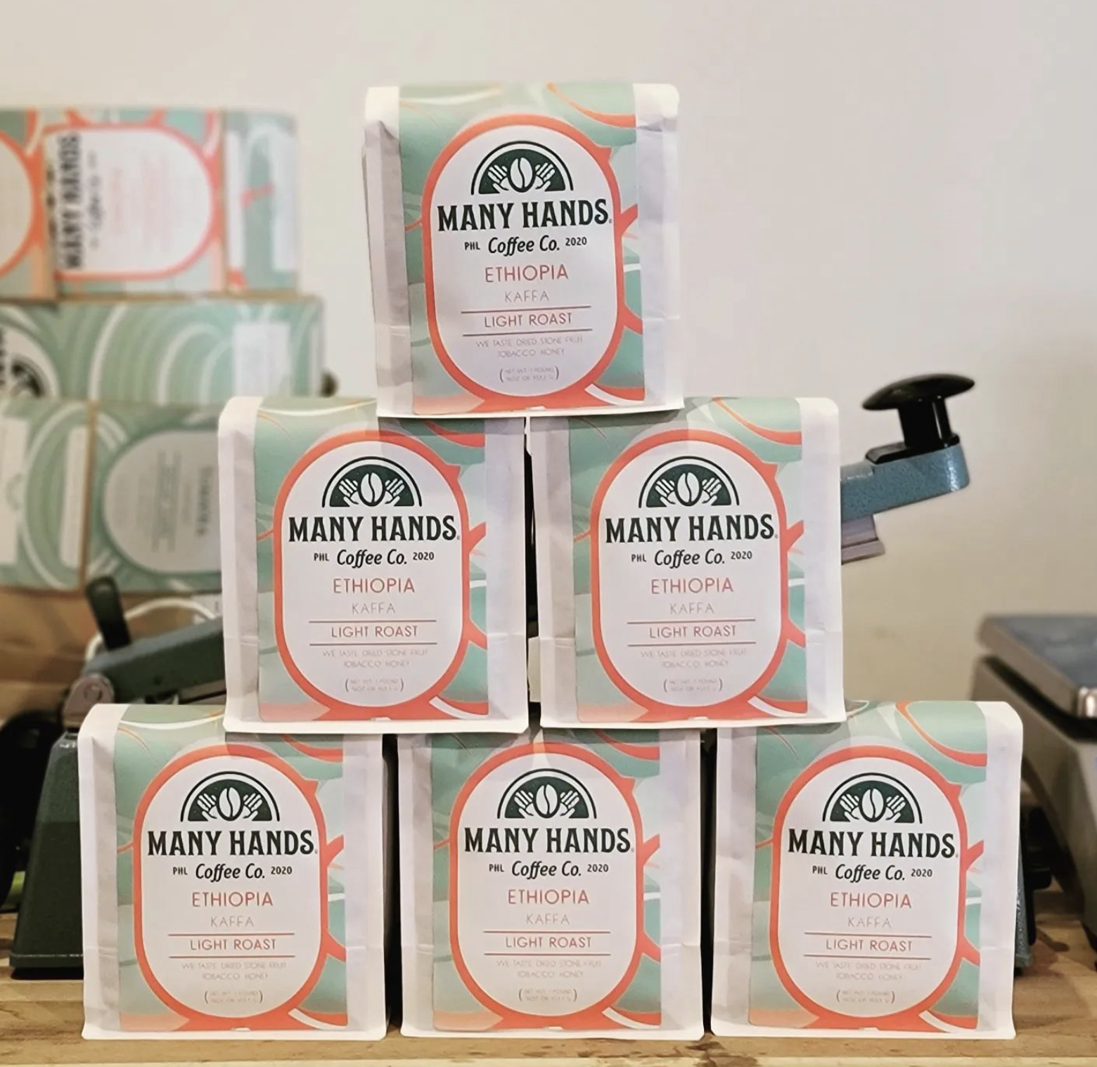
The boys were most into option 3! They had just some small tweaks to the label’s information but were ultimately really happy with the design.
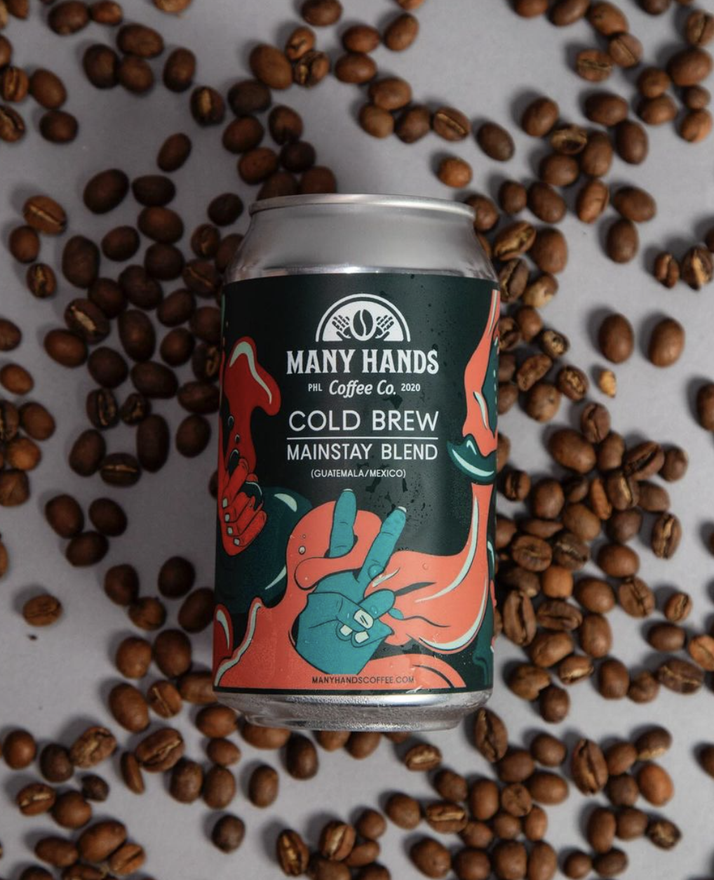
Many Hands needed 8 labels total — 2 dark roasts, 2 medium roasts, 2 light roasts, and two decafs. I paired design concepts and color palettes — using the darkest colors for the dark roast and gradually changing up the design.

I had just a few final adjustments to make before delivering the final product to Jeff and Miles — editable templates and a set of instructions so they can update countries, origins, and taste notes for all future labels.


