
Print Promo and Emailer Template: Eric Tate
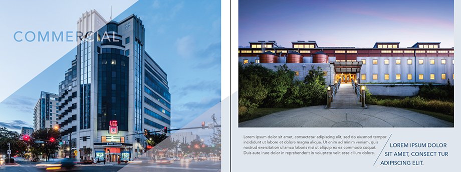
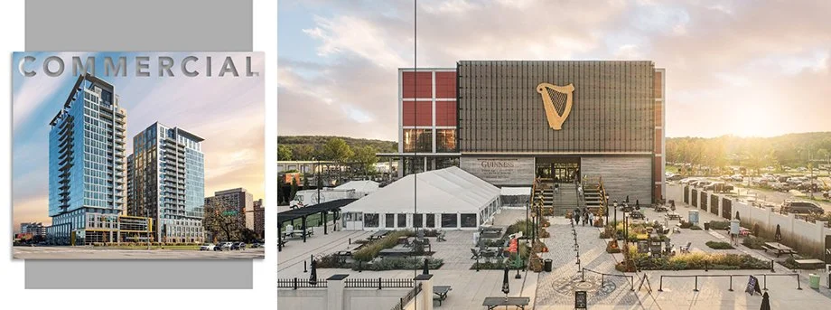
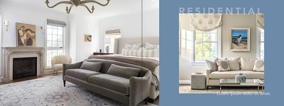
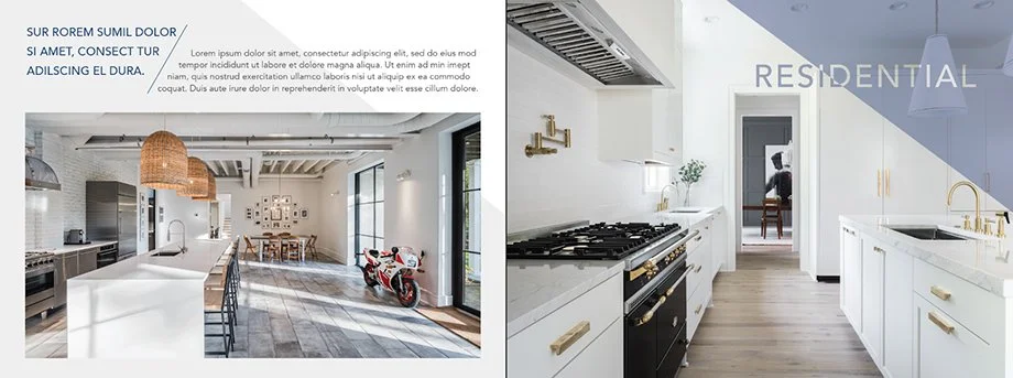
The second option was simpler. Instead of diagonal shapes, I used color blocks to highlight groups of images. I also made two options for the intro pages. The first option shows a drop-shadow feature in front of a color block. The second had a more saturated background color with white, translucent text.

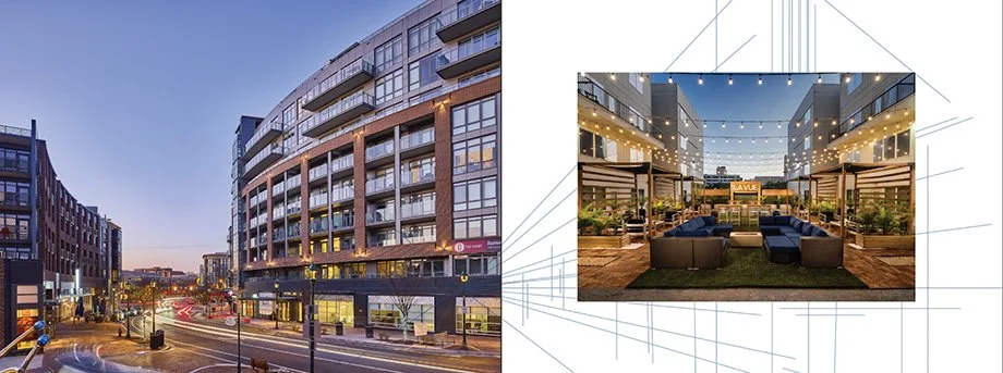
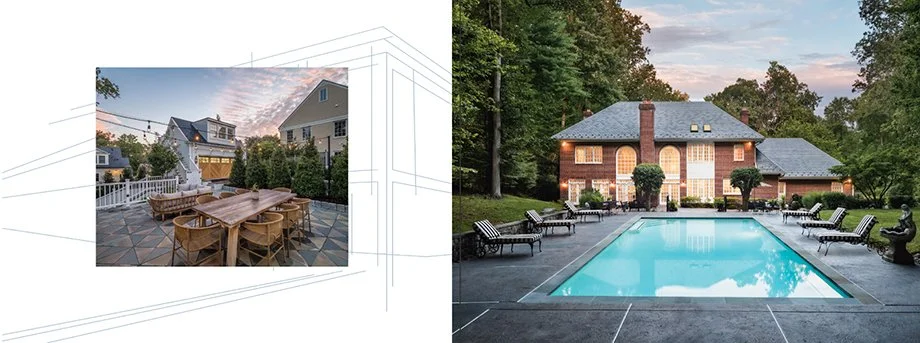
The third option featured thin, structured line work that mimics the architectural drawings you might see at any firm. These lines would weave behind and in front of the images, be custom for each page, and be paired with color blocks or overlays. (Still waiting for an architectural photographer to work with me on this idea!)
If you were in the market for an architecture or real estate photographer, Eric Tate might be your guy. His company, Peak Visuals, delivers top-quality photos and a solid, professional experience. The only question is — how do we get the word out about them? Eric came to Wonderful Machine to get his marketing gears in place, and together we helped him with promo design, copy, and building a client list. As the designer on board, I focused on the print promo and emailer design.
We started with the print promo, where I learned Eric was looking for a 6×9 horizontal booklet—about 20 pages long and featuring up to 40 photos. This was a lot to look through, so we wanted a clean, simple, and refined design. Finally, while Eric knew which photos he wanted to use, he hadn’t thought through the sequence yet, so I got to play the role of photo editor, too!
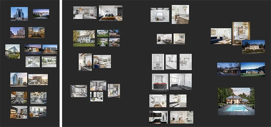
After sending these off, I put my focus on sequencing. Pulling them in Photoshop, I found similarities and patterns in the photos and paired them accordingly. After some quick feedback from our producer, Bryan Sheffield, they were ready for Eric’s eyes.
The feedback was quick and positive. Having gotten used to fast turnarounds while working with architectural firms, Eric had a response for us within a few short days. The plan was to carry out option 1 with the sequencing I laid out — the only change was adding a few extra photos. The rest went smoothly. I implemented the design on the remaining pages and added all of Eric’s images for Round 2.
With the addition of copy (courtesy of Varun Raghupathi) and just a few small tweaks, like image sizes and placement, we were ready to go. So I put the order in with Smartpress, and we had a soft (digital) and hard (printed) proof in the works. I’ve learned to really appreciate Smartpress — one of the most affordable options I found for booklet and promo printing. I think they have excellent customer service and can work with you on the most custom of orders. Now that my quick Smartpress ad is over, we confirmed the order after seeing the proofs, and sooner than later, Eric was equipped with 100 copies of his new print promo.
Here’s what Eric had to say:
I appreciate all the hardwork from the entire team! This is an amazing marketing initiative that I couldn’t have pulled off without Wonderful Machine — especially all of Lindsay’s insight and expertise.