
Treatment Template: Michelle McSwain
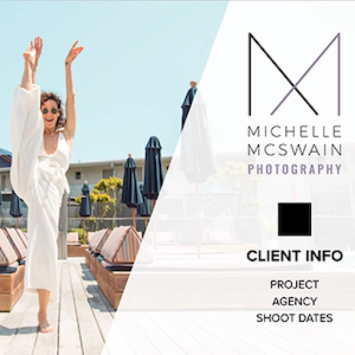
The second option used a similar concept, but I used straight strips instead, varying their placement, color, and transparency. The title on each page was slightly larger in this second option and bled into the strips to tie the design together. In all three options, I stuck to the palette used for Michelle’s logo and website.
There’s something about a tight deadline that gets the adrenaline pumping and adds an extra challenge to my process. And with a photographer as talented, creative, and laid-back as Michelle McSwain, you know it’ll be a good time.
Michelle was introduced to a client whose creative brief aligned easily with her work. To show her full potential, she wanted a new treatment that showcased her photos and capabilities in a sophisticated but fun way. The added challenge was she had about 24 hours to put it all together. So she came to Wonderful Machine, and together we created a template for this pitch—and future projects.
Whether designing a template, emailer, or logo, I start by learning the photographer’s brand, goals, and preferences. Once I have the info I need, I create several options, each implementing different aspects of their brand.
I sent Michelle three options. In the first option, diagonal color blocks are stretched across the corners of the page. These shapes were meant to represent the downward slope in the “M” that makes up Michelle’s logo.

Option 3 used a darker background and used her logo as the main design element. For the cover, I cropped photos to fit the logo's negative space. On the interior pages, I mixed up the logo's size and transparency so I could lay it over the photos and text.

Sometimes you make several variations, but you know deep down what the client will go with. In this case, I had a good feeling about that first option, and I was right! At the end of the day, Michelle wanted to move in the direction of diagonal color blocks. By the next morning, we were ready to officially put everything together!
We wanted a palette that aligned with Michelle’s brand and the client’s identity. With that in mind, I made a few initial tweaks to the design and added an extra page of graphic elements before sending it to Michelle.
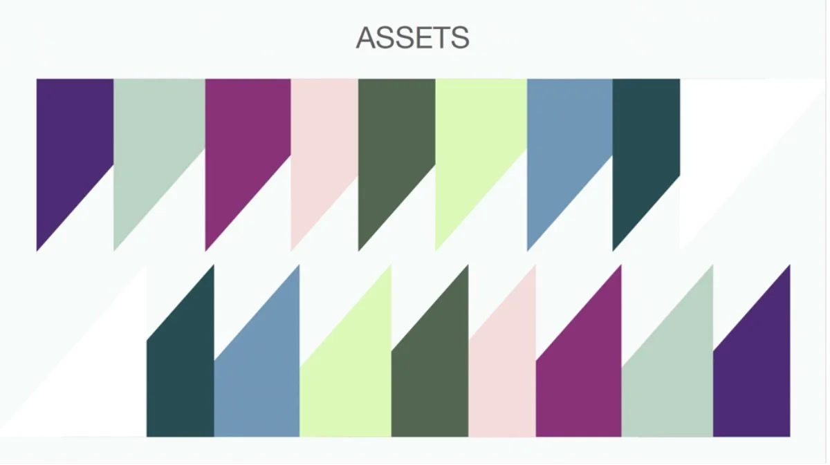
I gave instructions to copy any triangle and paste it onto the desired page. She’d mostly just need to adjust the opacity and be good to go.
She is familiar with Keynote (an Apple-based program we often use to create treatments), so we knew it’d be easiest for her to add photos and text, and I would review everything to make sure the layout was as strong as possible.
Michelle sent her changes over for me to adjust. Everything looked great—I just adjusted the size and arrangement of some elements, depending on whether I wanted a color block in front of or behind a photo.
Working hand in hand, we met the deadline and got this treatment to the client! Now she has a kick-ass template to share with future clients!
Here’s what she had to say:
Thank you so much for touching base. And thank you x1000 for all your speedy help with the treatment. It came out so beautifully and I am so grateful for the quick turnaround. It’s been a little crazy over here and I ended up not winning that particular bid but I’ve already used the treatment again for a different proposal and won that one. So grateful for all your hard work.