Wirlybird Coffee
My first major project with Wissahickon Brewing Company was to develop the brand and voice of their new company, Wirlybird Coffee.
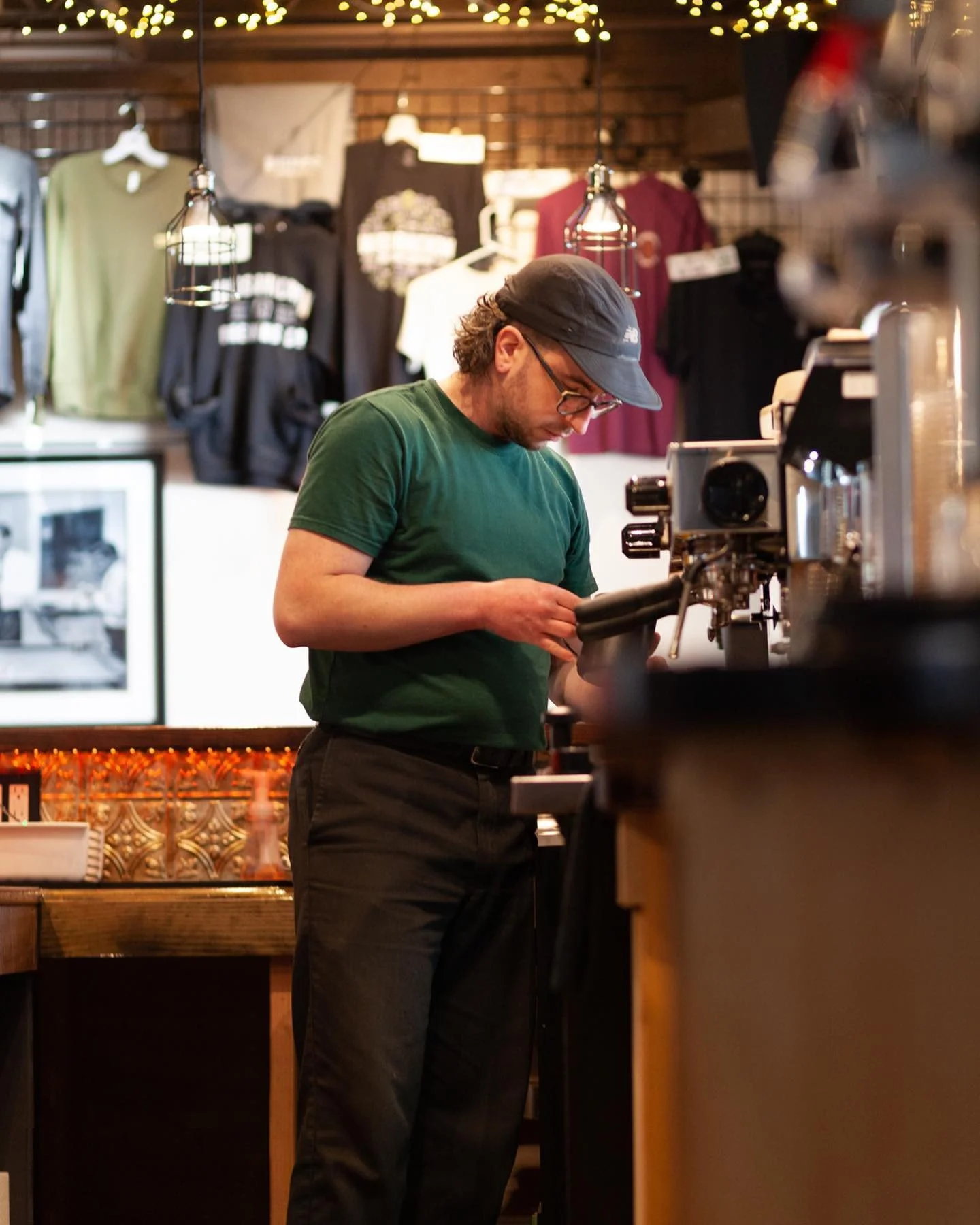
I have worked in coffee shops all around Philly, and It will always be one of my most valued experiences. I believe coffee shops are one of the ultimate communal spaces—enthusiastic conversations, fueled by caffeine. Baristas, making coffee in the morning and exploring personal passions at night. My time behind a coffee bar was the most connected I felt to this city.
I’ve been lucky enough to work with several small businesses and coffee shops, but Wirlybird is the one I’m most proud of. From hand-drawing the logo to transforming the brand into a playful & modern look and crafting content that resonates with our regulars has been rewarding and, for lack of better terms, really fun!
logo


Colors
#1F1B19
#79A983
Fonts
The Brand
#ABC4AE
#EF5B4E

Used for all products, signage, headings, and social graphics
#F27D6E
#FEAAA9

Used for product details, sub-headers, descriptions & copy
When I first joined the Wissahickon team, all this brand had was a font. In the next month, we developed the beginning stages of the Wirlybird Coffee brand.
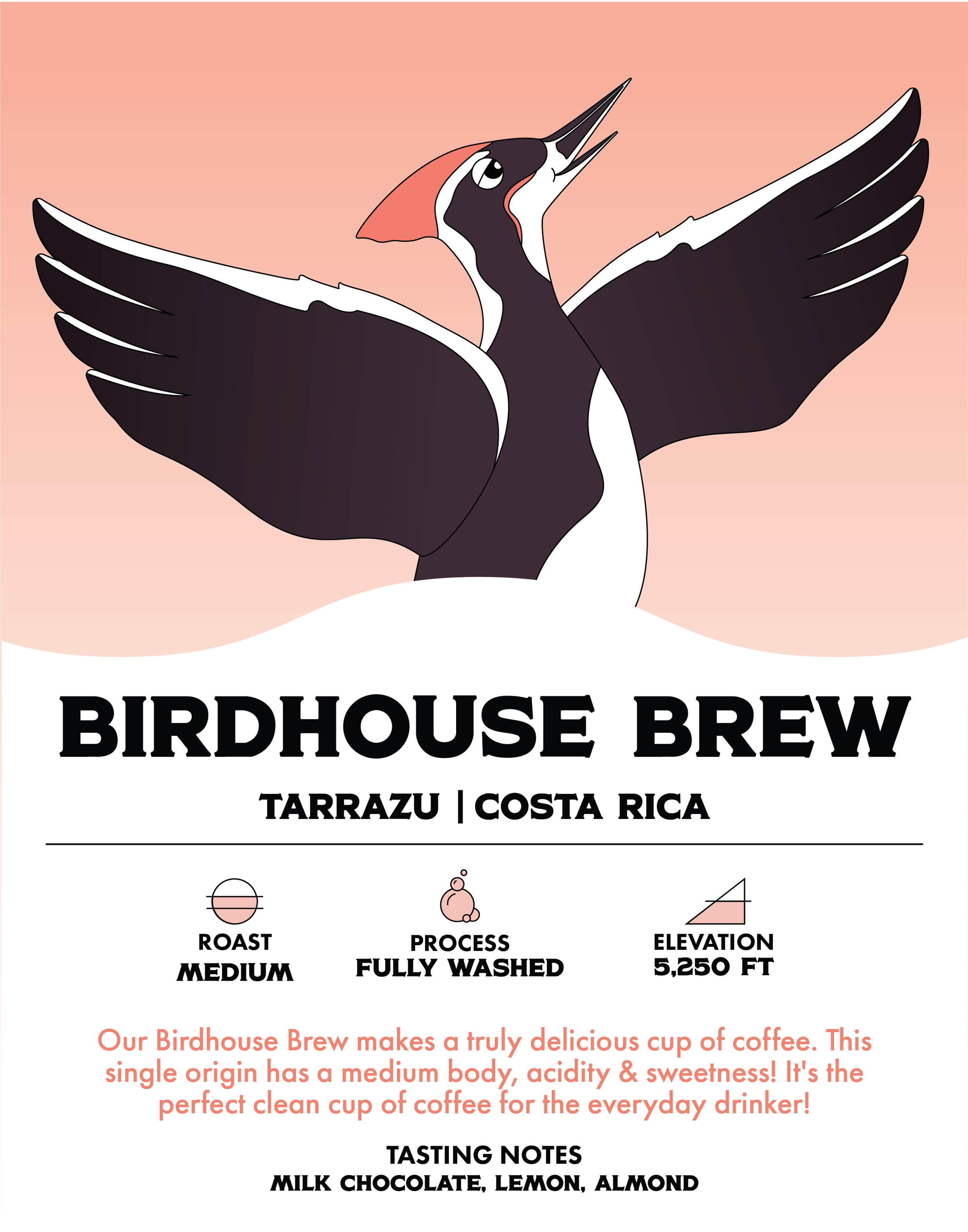
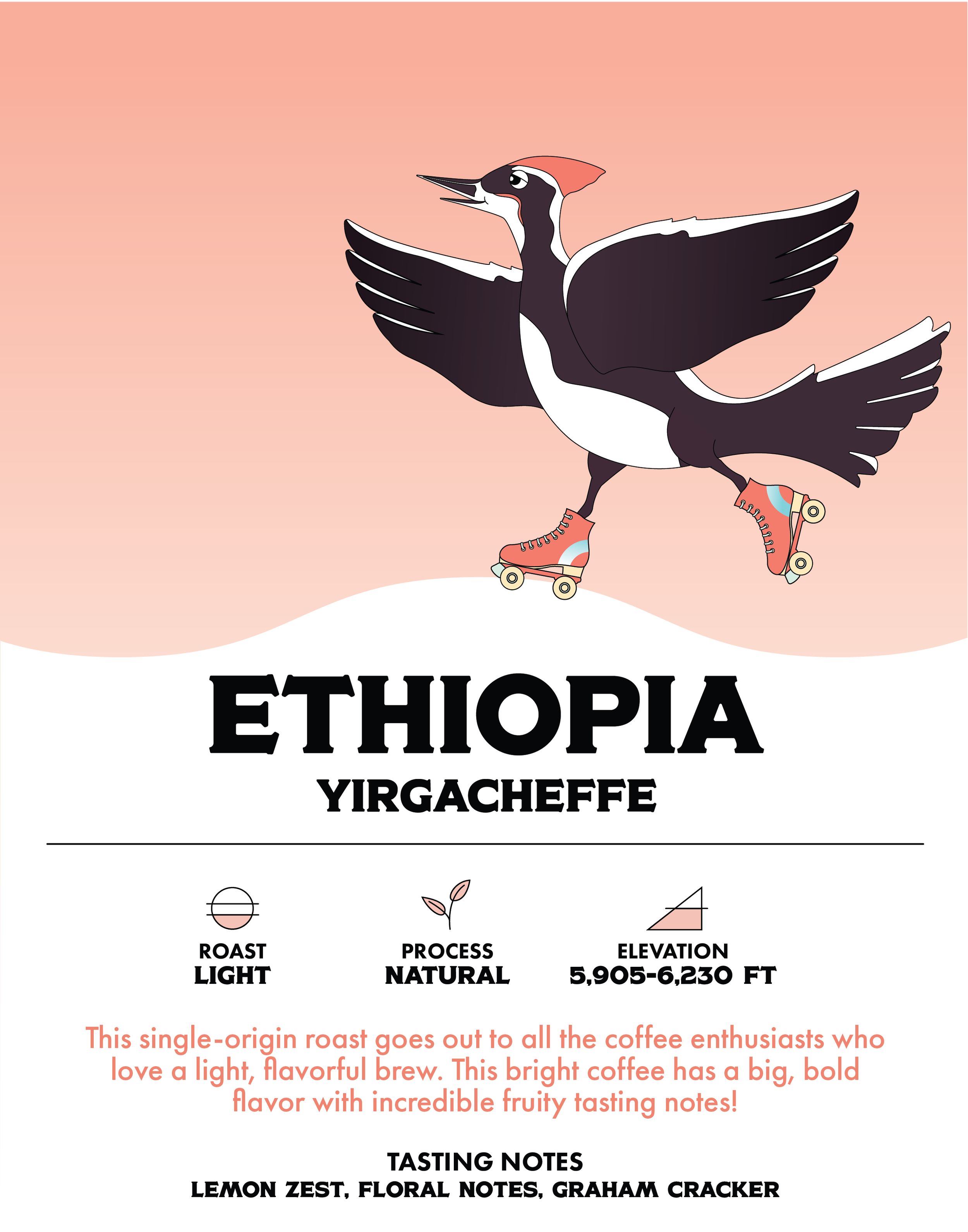
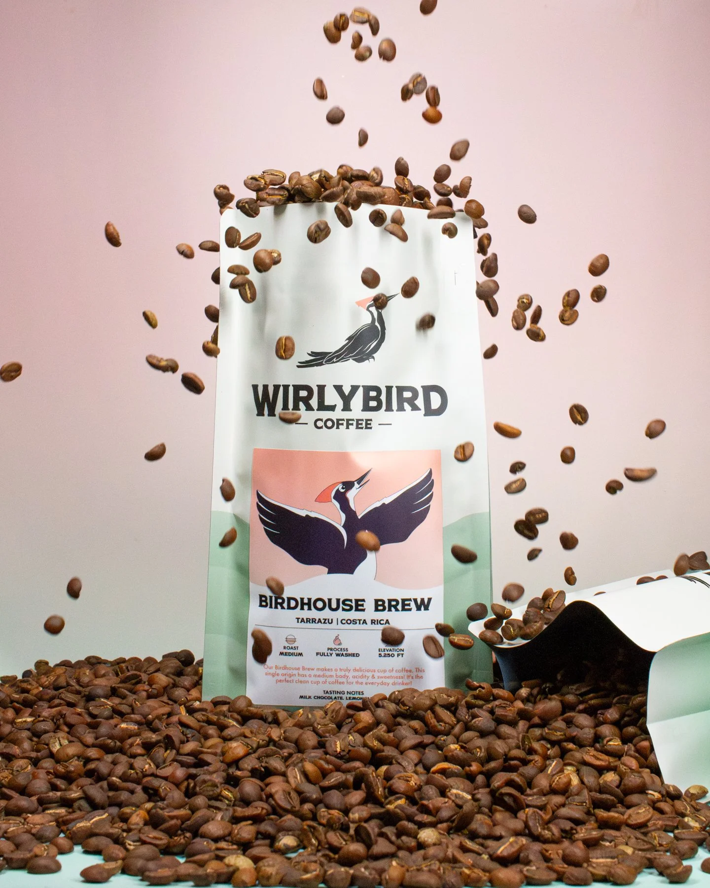
Inspired by our beloved Philadelphia-based park, Wissahickon Creek, we wanted to celebrate the wildlife & nature of the land. With a name like Wirlybird, there was one animal we couldn’t get our minds off of. Therefore, the pileated woodpecker became the symbol of our brand.
I hand-drew & digitalized the logo, and we selected the color palette as a team. Over the next year, those colors and details were fine-tuned to become a cohesive & energetic brand identity.
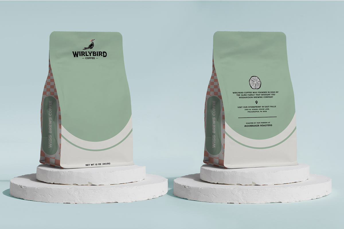
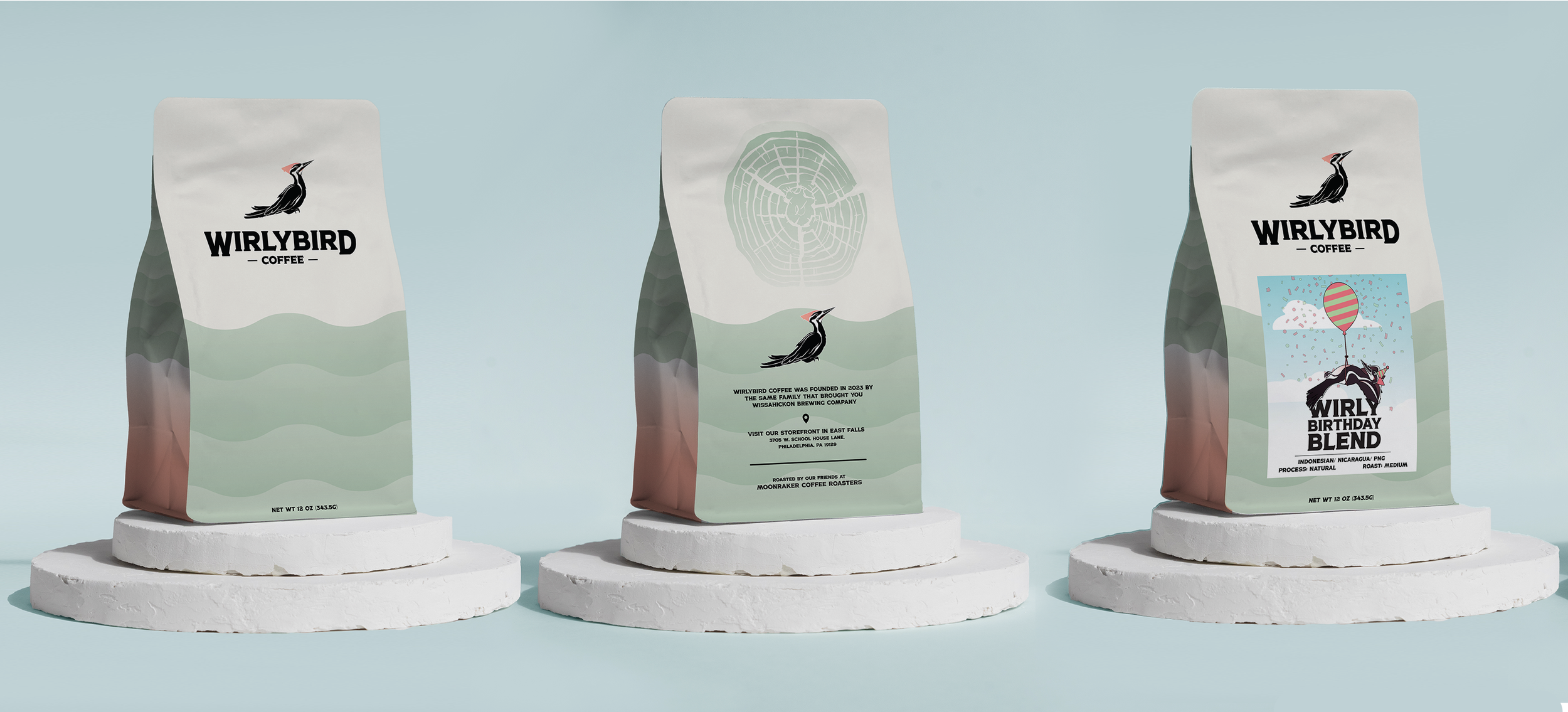
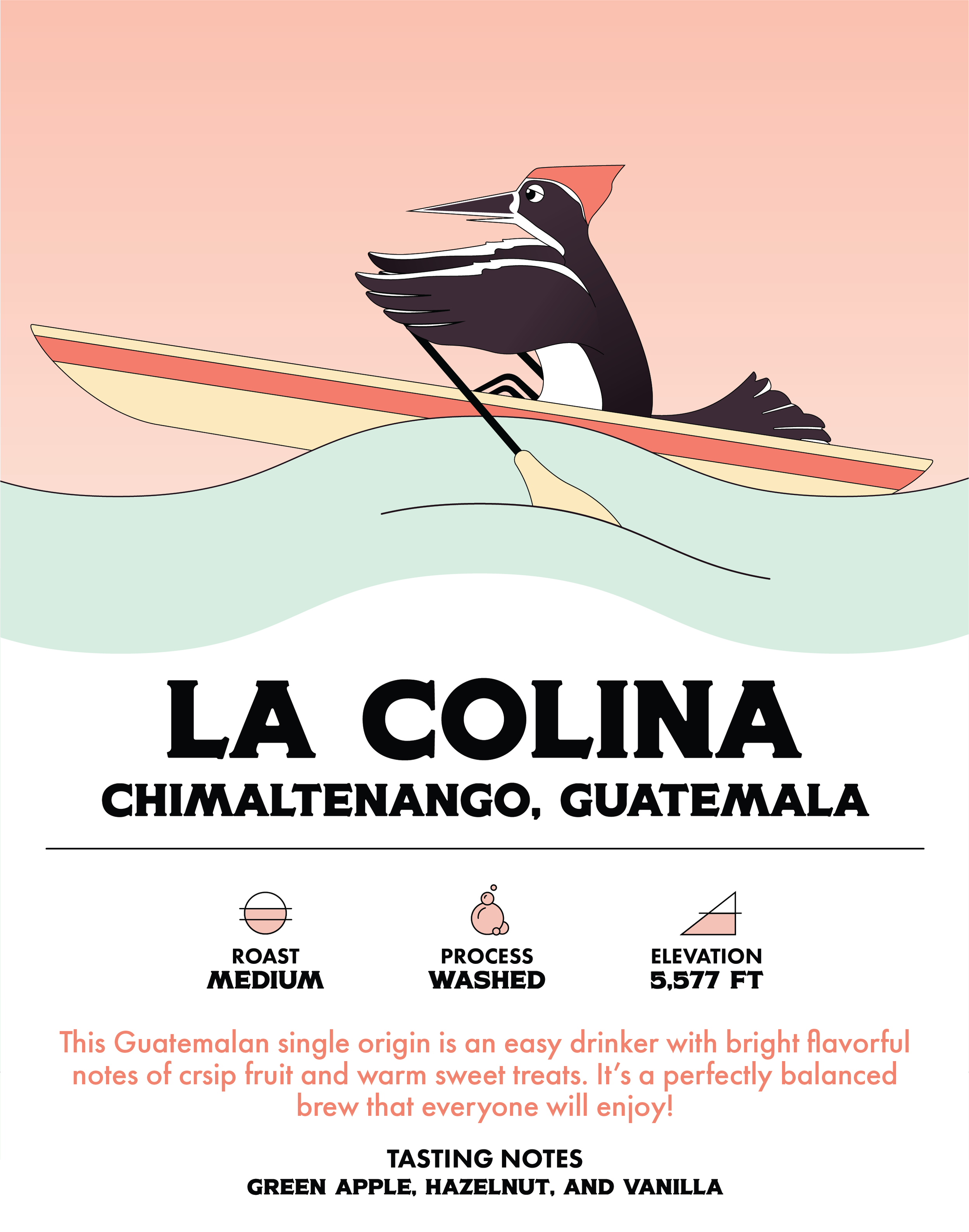
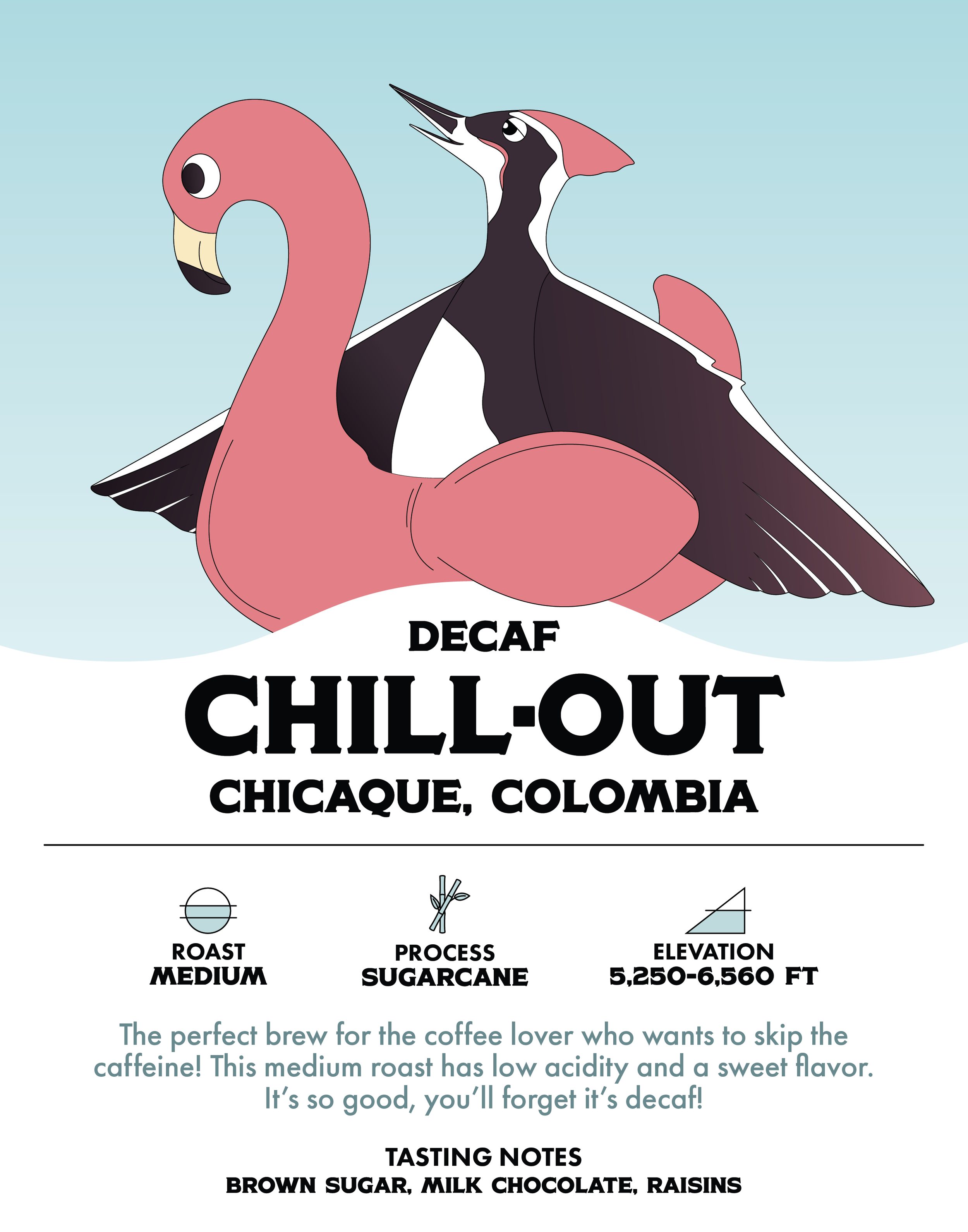
bag design
Wirlybird Coffee labels capture a playful look. I incorporated the woodpecker from our logo, creating individual cartoon-like designs for each label. The woodpecker is depicted in a variety of energetic daytime activities, showing the active lifestyle brought with a cup of locally-roasted coffee. Below each design, there are the details for every roast, with a set of icons to provide context for roasting styles & origins.
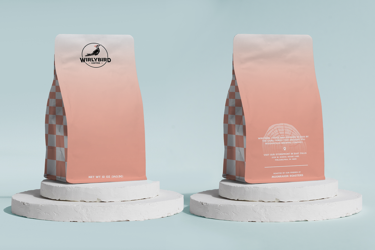
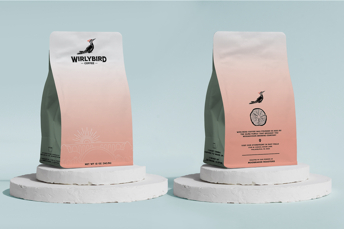
The bag itself was a collaborative effort between the coffee team and me. With several options to choose from, we found a bright, simple, and modern approach that created the foundation to support more detailed labels. The result is a beautiful and clean final product that we are all very proud of.
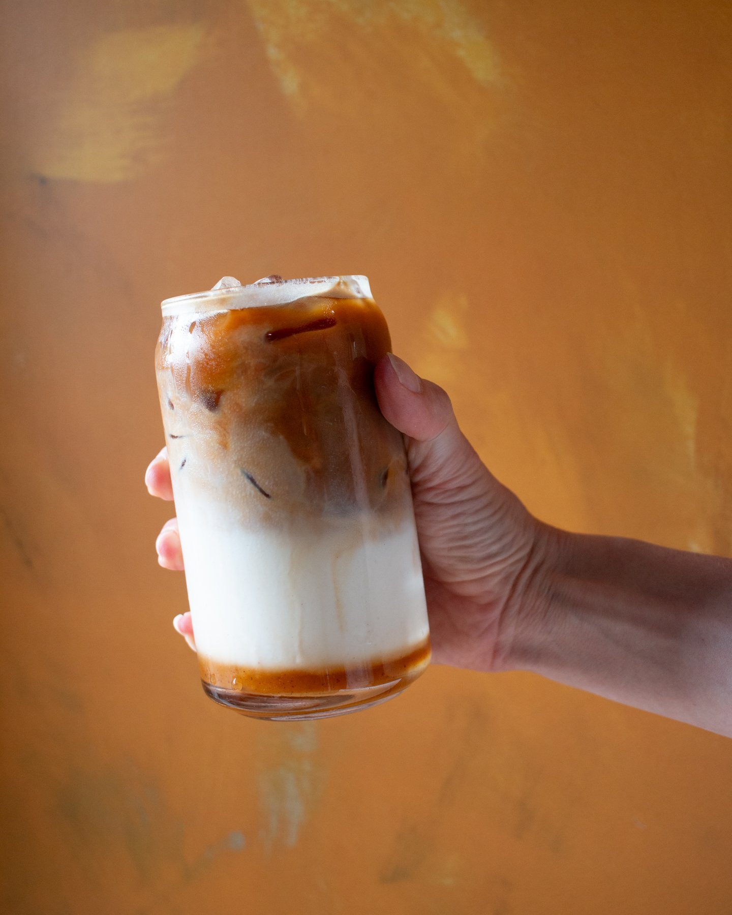
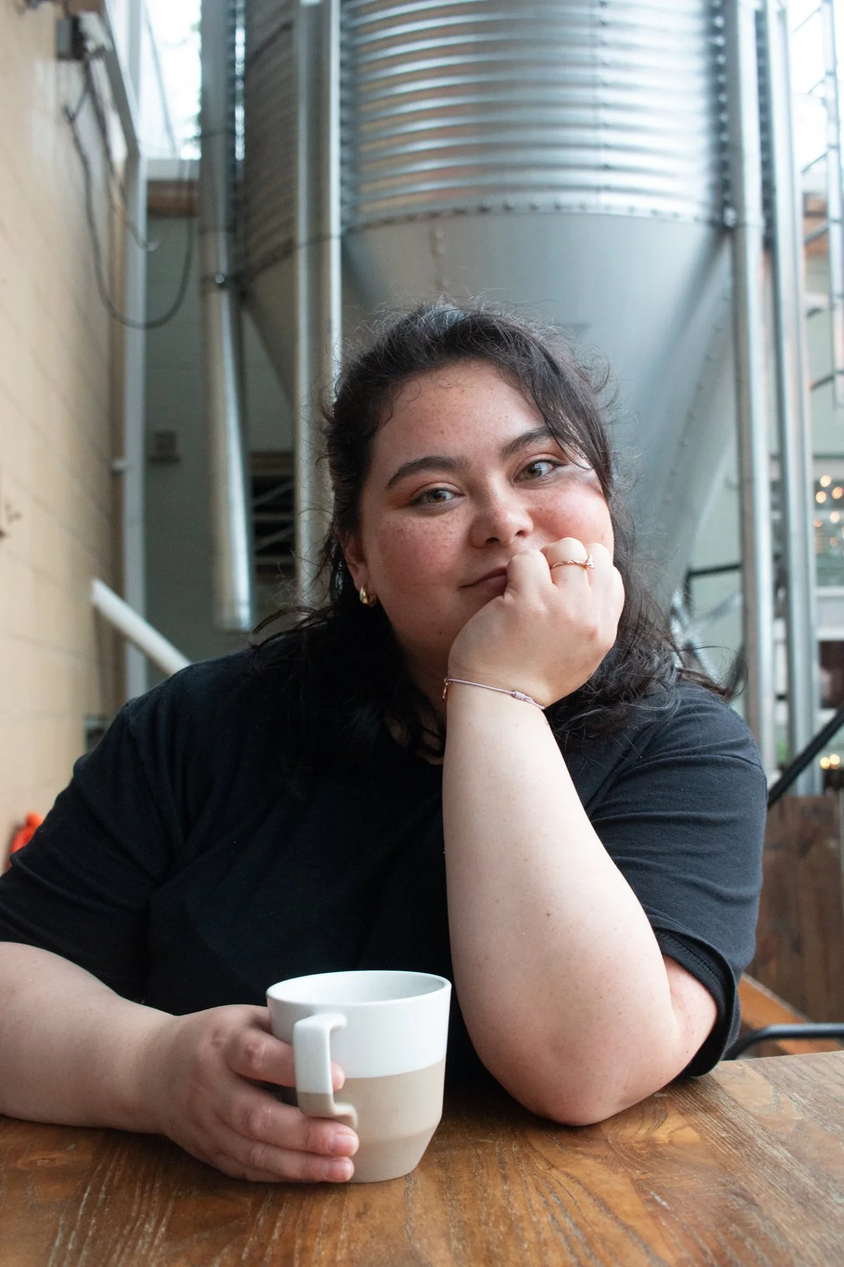
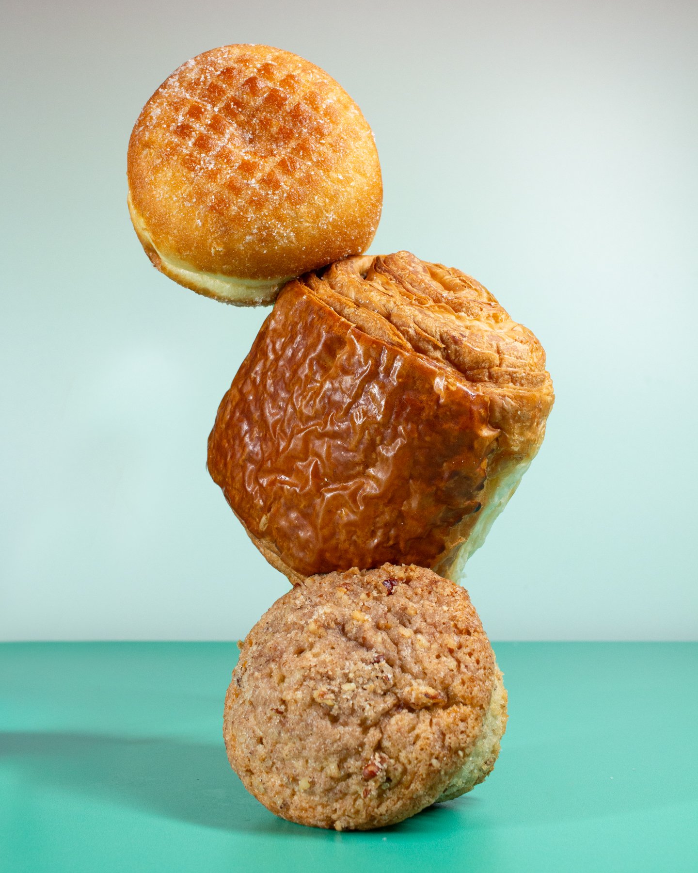
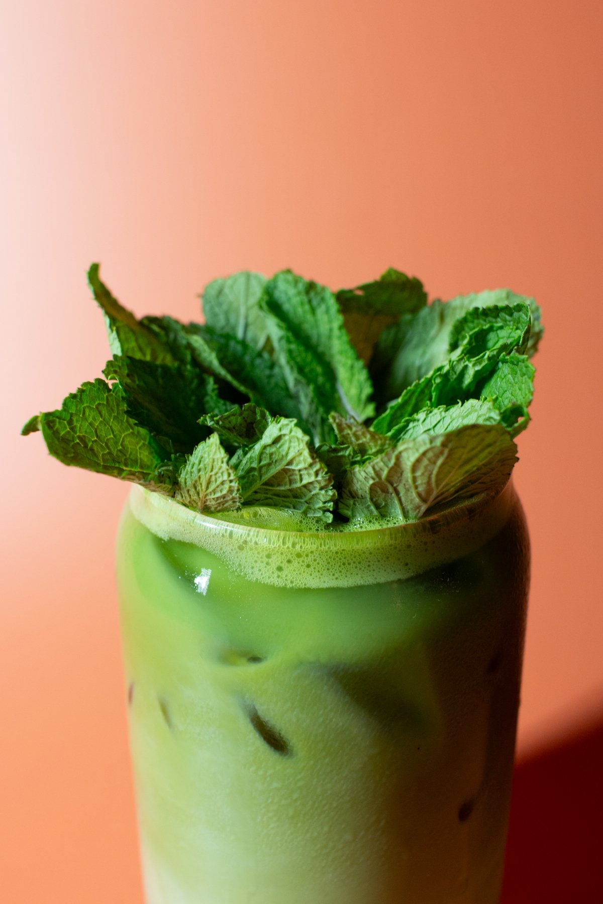
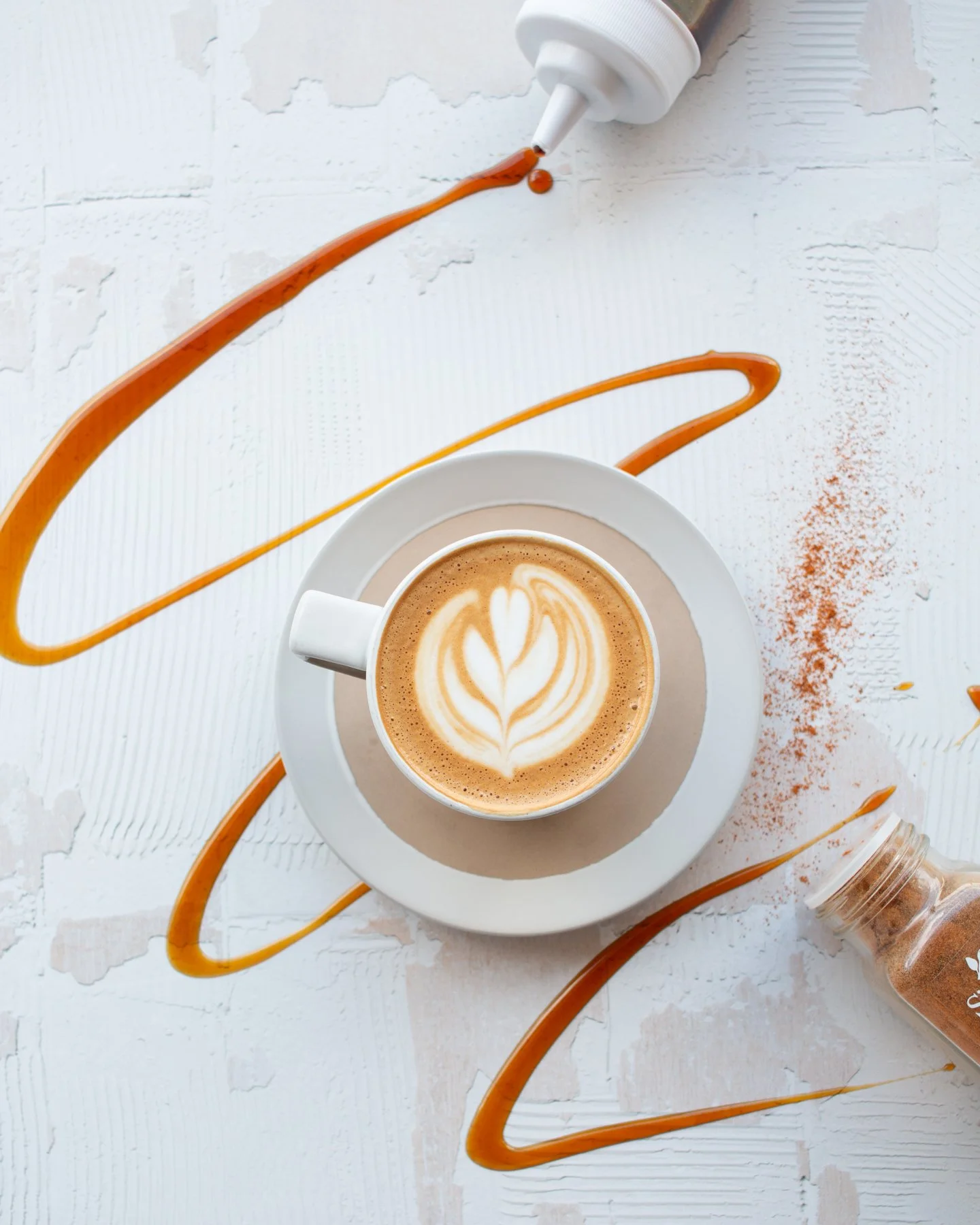
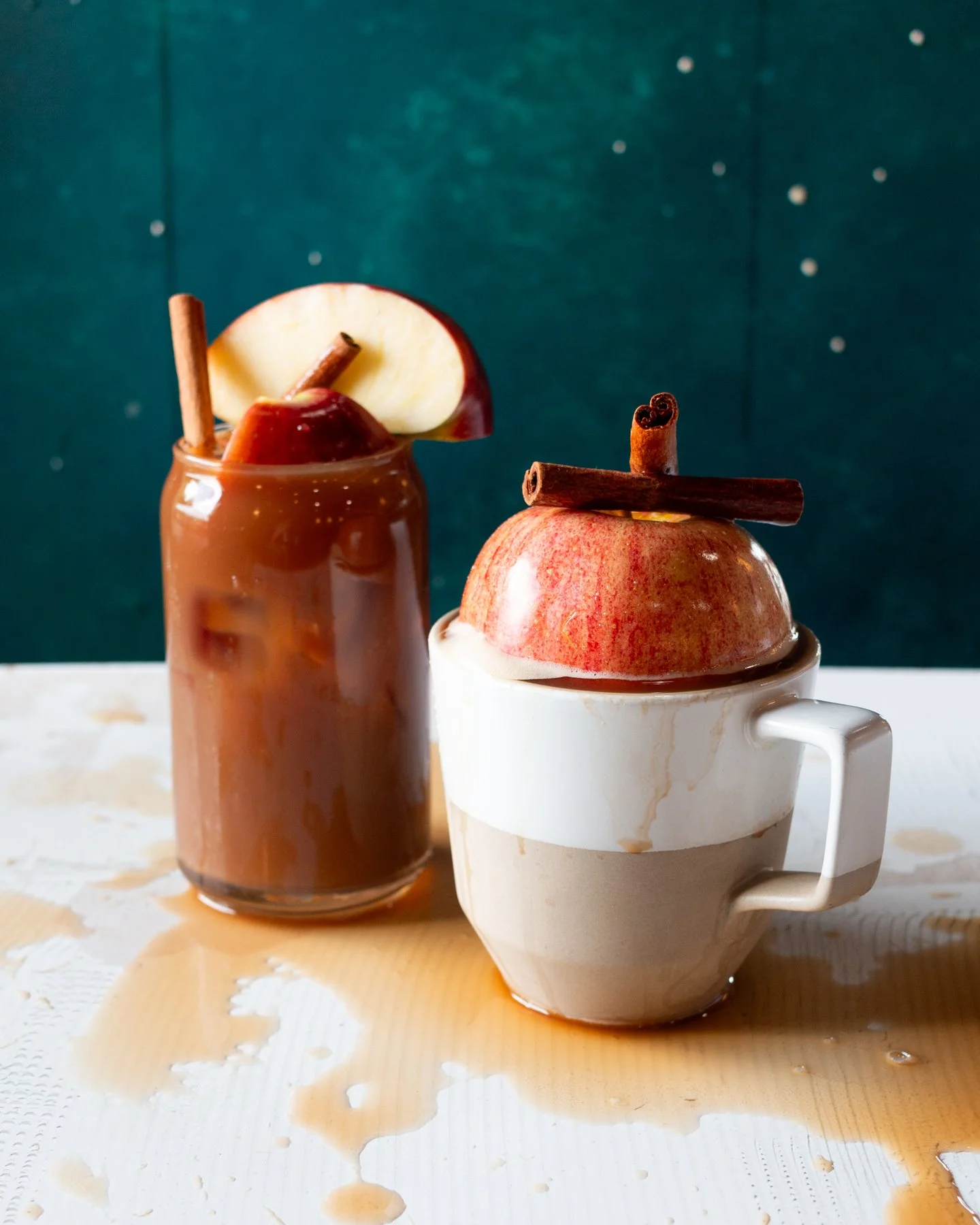
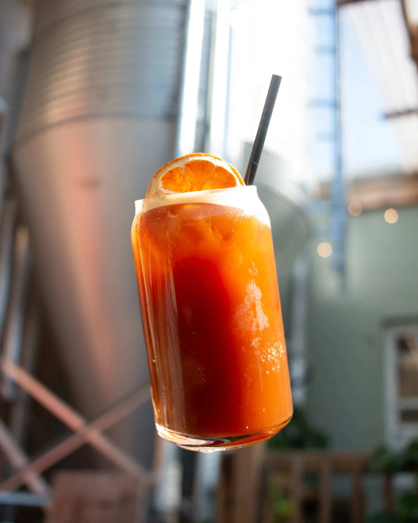
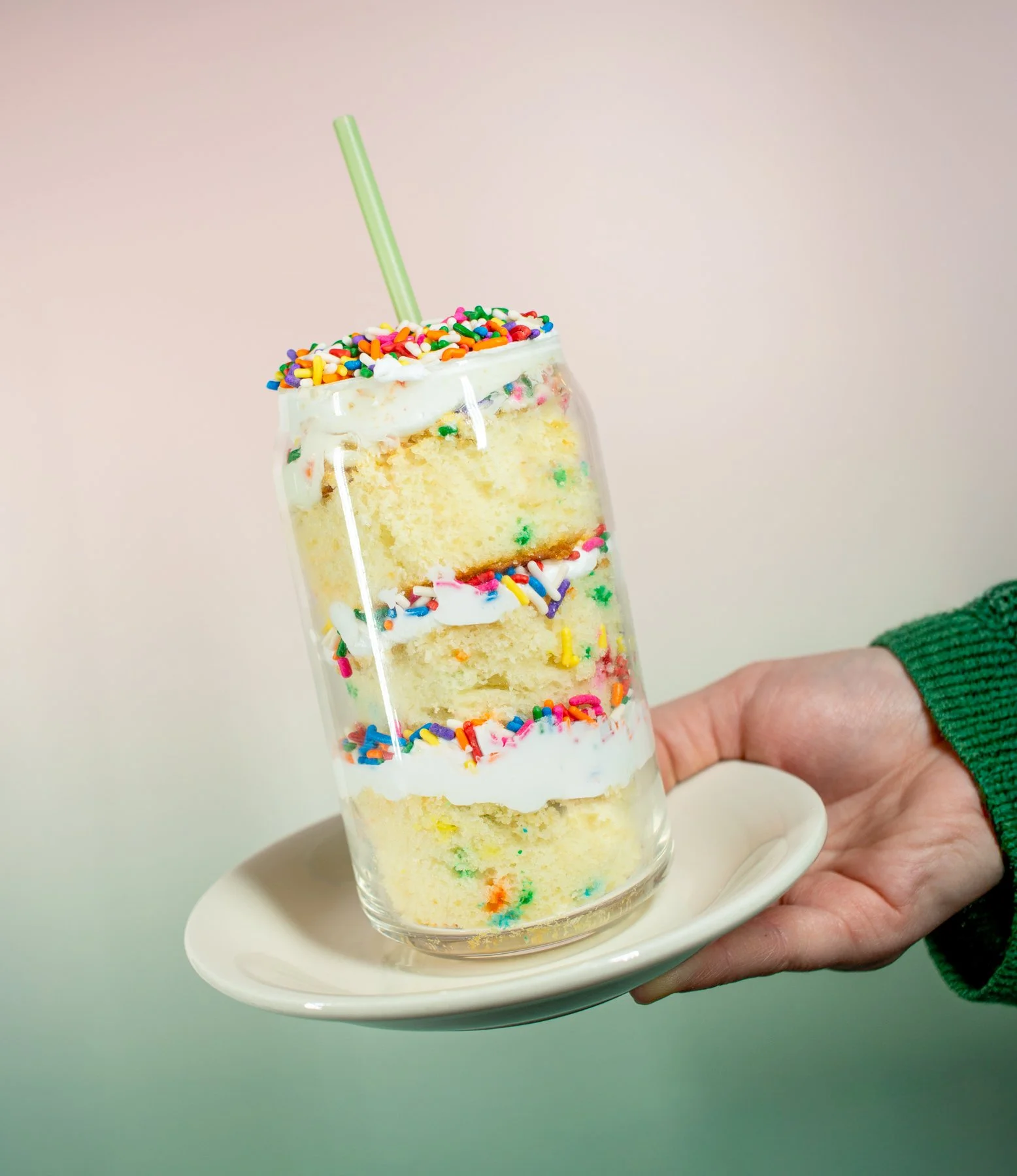
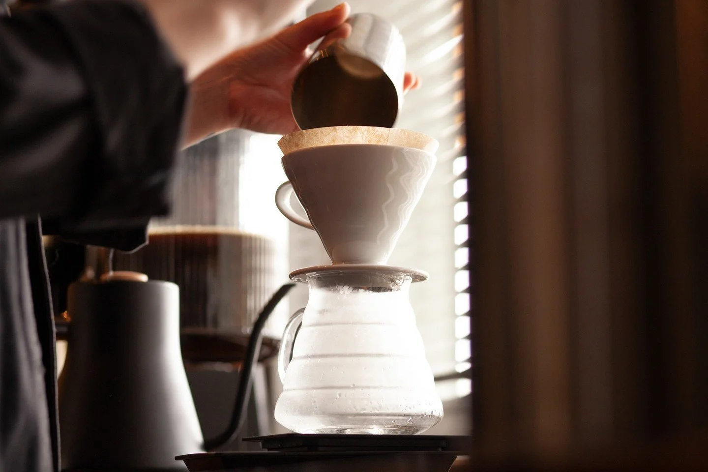
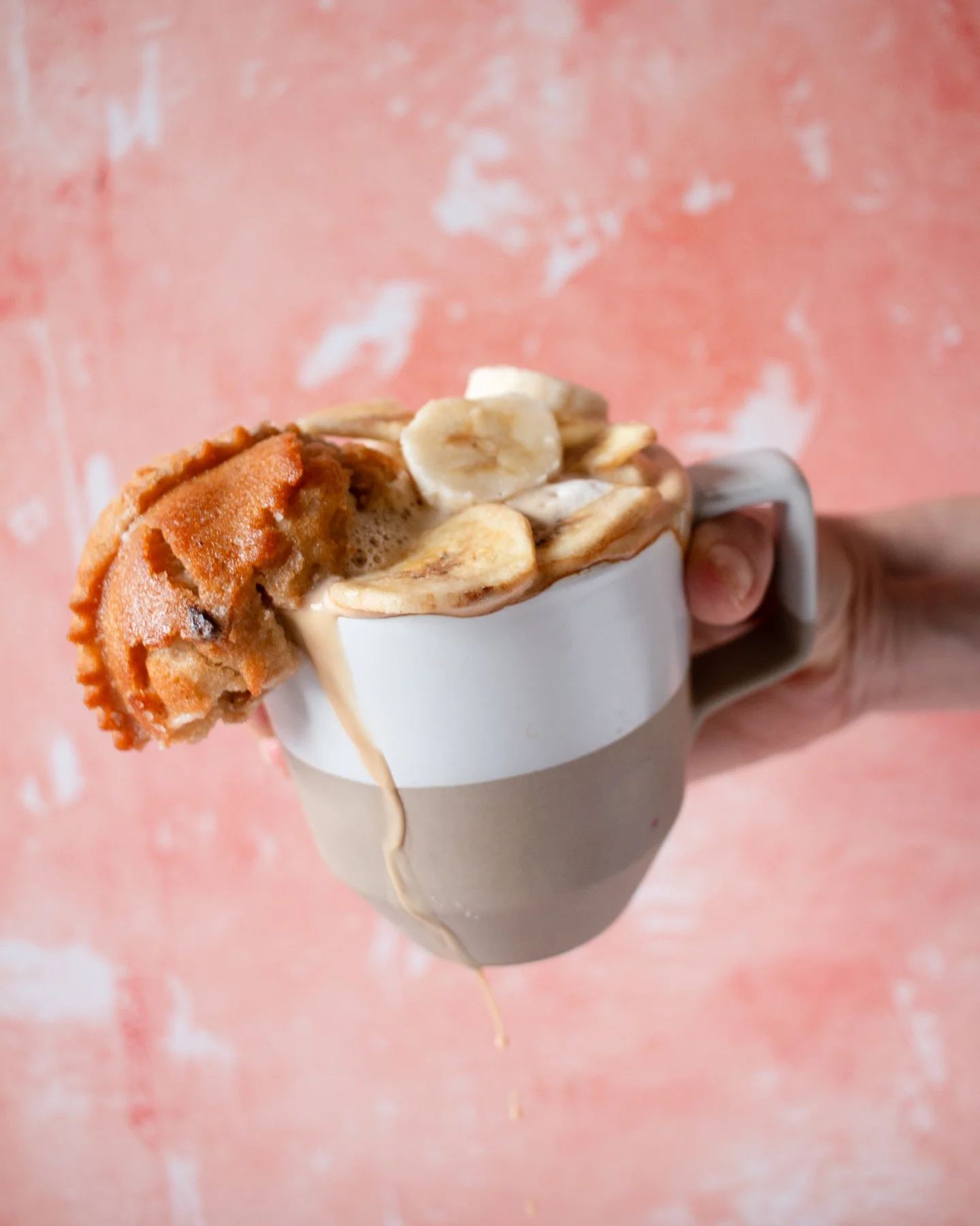
Marketing & Social Media
For the most recent & detailed look, please see the wirlybird coffee Instagram account